I started this project without any web development skills to speak of. It is a bit of a real-time experiment; seeing if and when technical blockers become insurmountable without really diving into JavaScript and how much product refinement is actually possible with this method of working. It's also a forcing function to learn SEO and monetization.
Here's a quick rundown of the process so far and what's coming next. In the weeks prior to getting started, I spent quite a bit of time researching tools and development plans, but that quickly became a rabbit hole. Ultimately, the right decision seemed to be just getting started, and accepting that it would be a messy, imperfect process which would involve learning and refinement along the way.
Below is a screenshot of the first version of the game. Claude helped with the CSS and JavaScript, and guided me through setting up VS Code, Github and a few other basic tools to manage the project. This first version was semi-functional, but obviously the layout was weird and the UI was super primitive. The main accomplishment here was simply that the project could be considered underway.
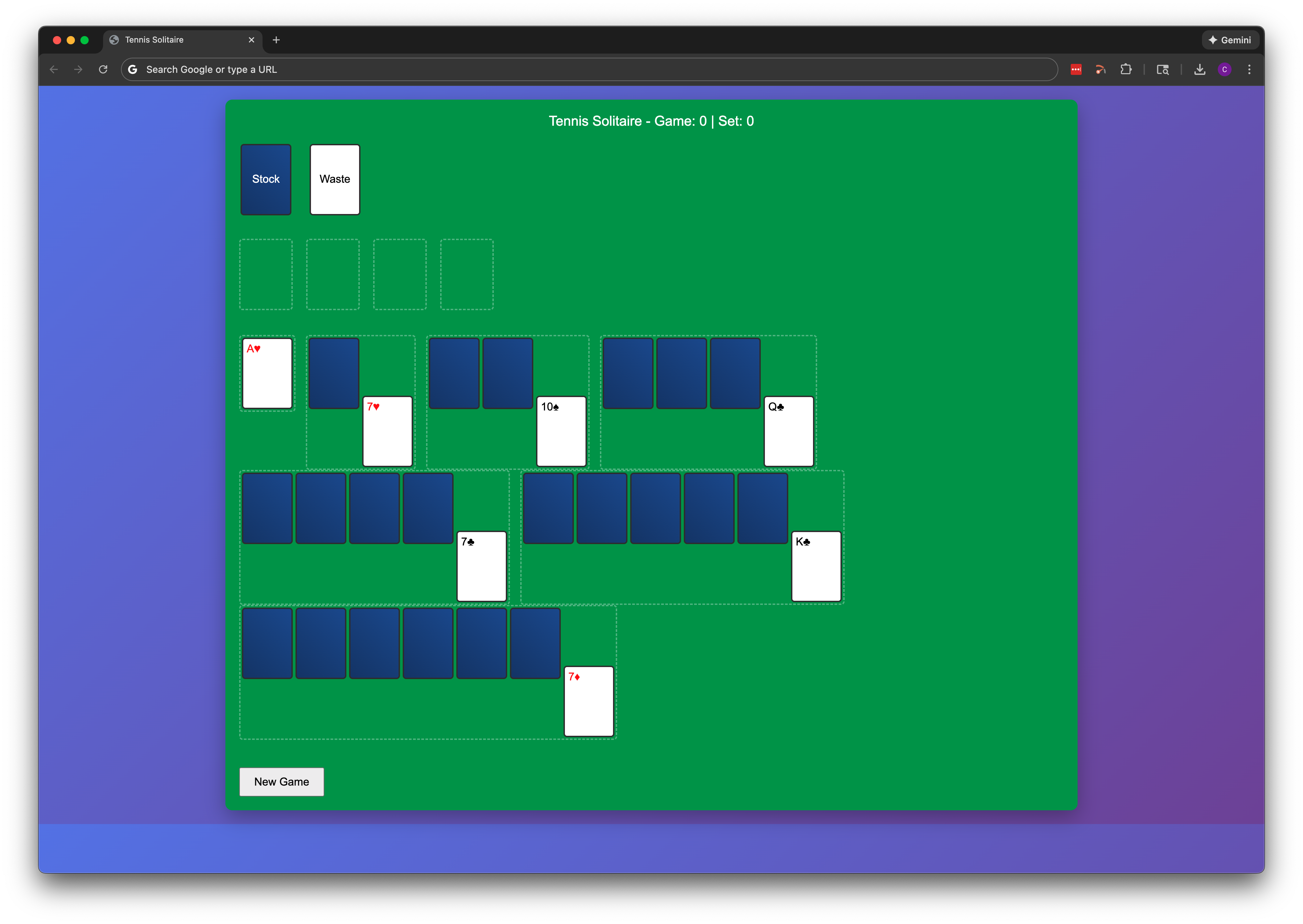
The first priority now was getting the basic layout into a traditional klondike solitaire format, with the card stacking and the placement of the piles. You can see the results below. The scoreboard at the top of the UI wasn't functional at this point, but the plan was to implement some sort of tennis-based scoring system so it was a placeholder.
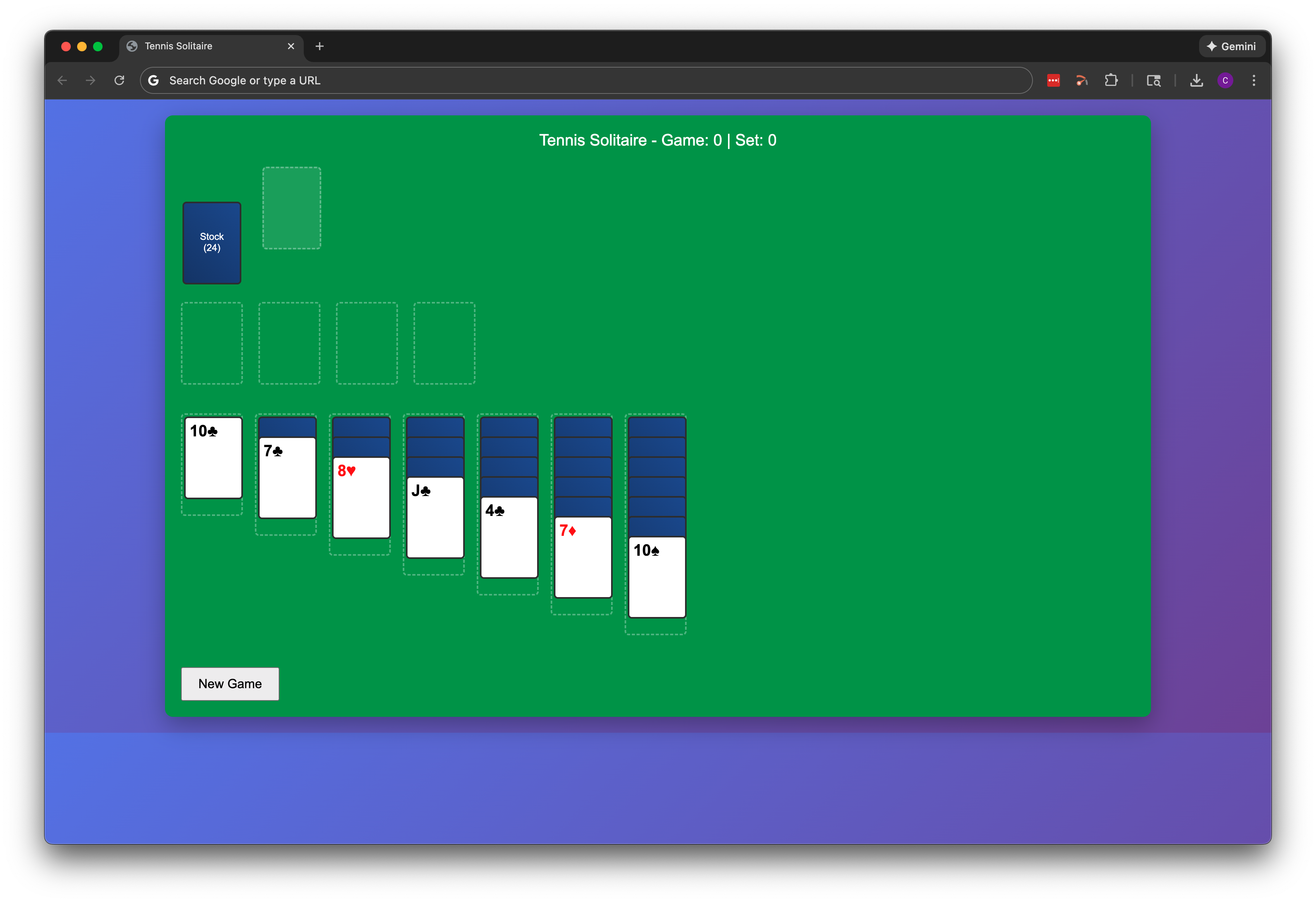
At this point I started tinkering with piecemeal changes to try and make the early prototype look better. I started down a path with Fronty, but wanted to be a little more hands-on as I got familiar with the code and realized I would have to basically scrap the basic gameplay mechanics that had been established.
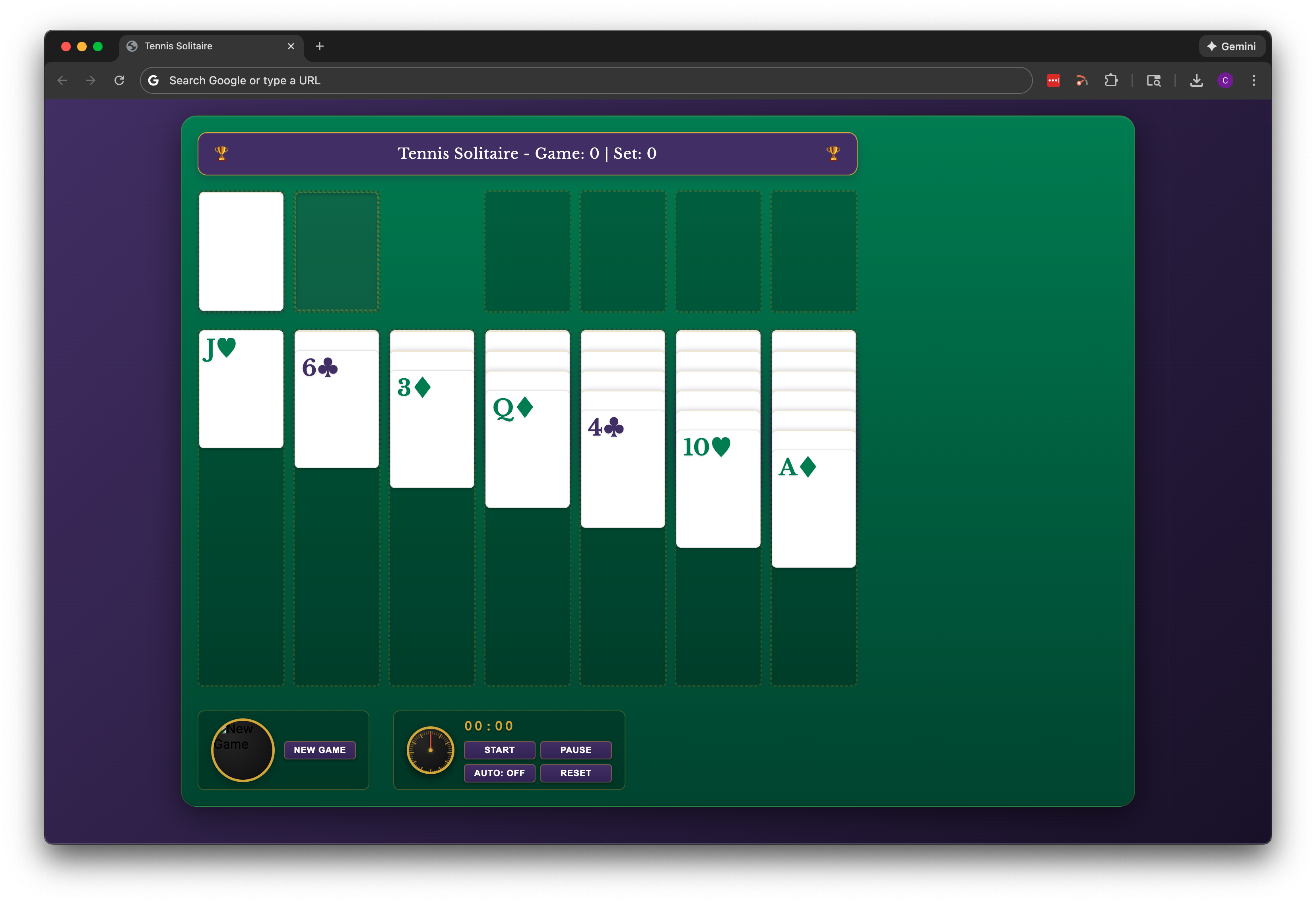
Given that this is Tennis Solitaire, I went to a bunch of major tennis websites for inspiration, and then worked with Claude to create an updated layout and color scheme. The results are below, including an early attempt at recreating the Rolex match clocks you see at major tournaments (this element was eventually abandoned as it became clunky on smaller screens).
It's not in these screenshots because rebuilding the local image file path is a bit of a pain, but this is also the time when I started working on the card back design and created the placeholder version which stuck around for longer than expected. There's another post on that process here: Designing the Card Back.
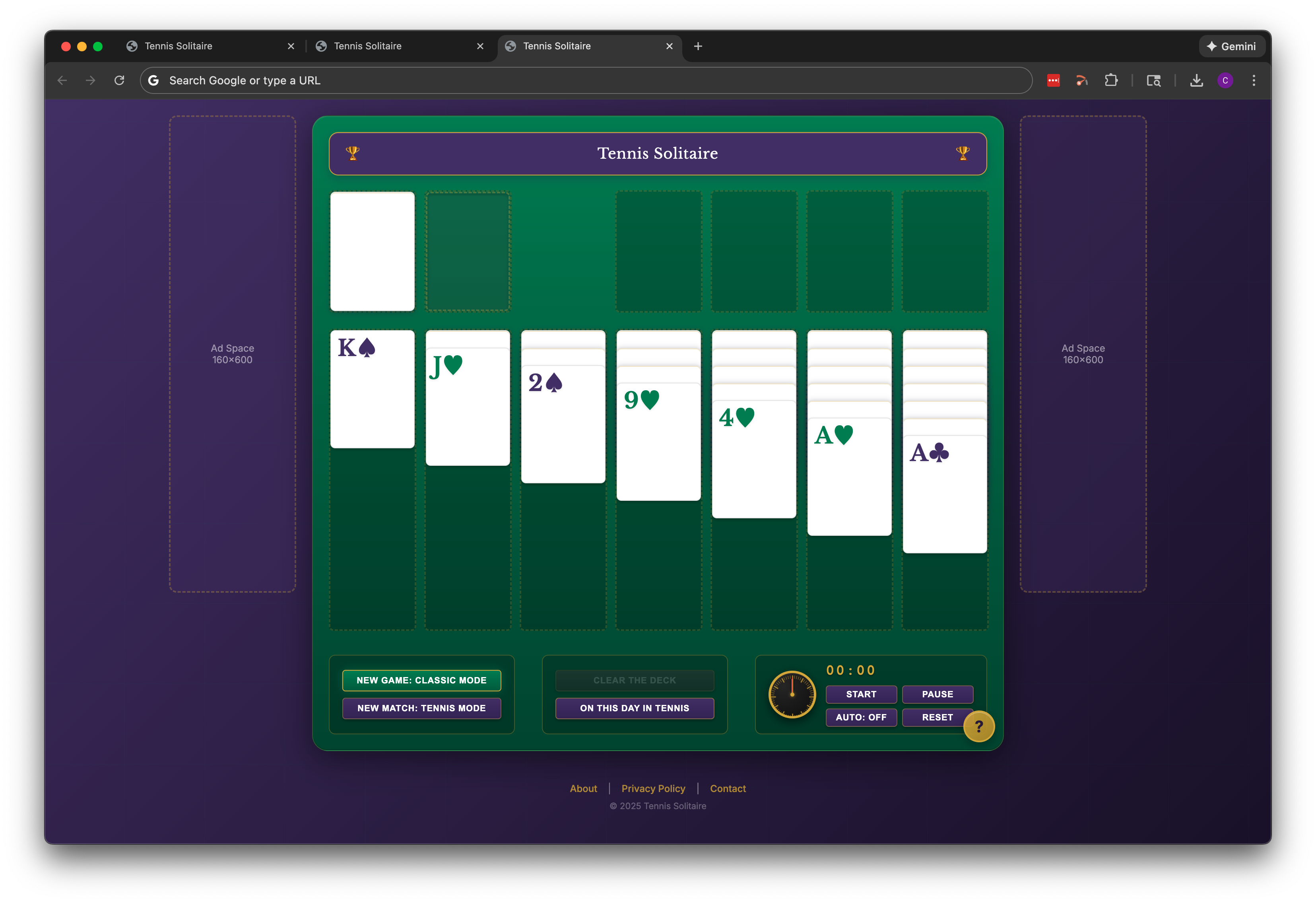
From here, I started tinkering with the button layout, implementing two distinct modes of play (tennis mode and classic mode), and figuring out where ads would go and how to design for that. Around this time I decided, naïvely in retrospect, that I should just get the game online and start figuring out monetization ideas. This proved incorrect, as there was quite a bit more work to be done before I was ready to tackle that. However, deploying the site for the first time did force me to prioritize creating those footer pages (About, Contact, Privacy); not the most fun diversion, but it had to be done.

Next up, I added the "On This Day in Tennis" feature. Initially it was an API call to Wikipedia that would display a notification above the game. This didn't work, as the call took 10-20 seconds and made it feel like the button was broken. Plus, even Wikipedia doesn't have a good date-specific tennis fact for every day of the calendar year readily available via an API. The help button also made its first appearance here, as a fixed UI element with basic pop-up instructions.
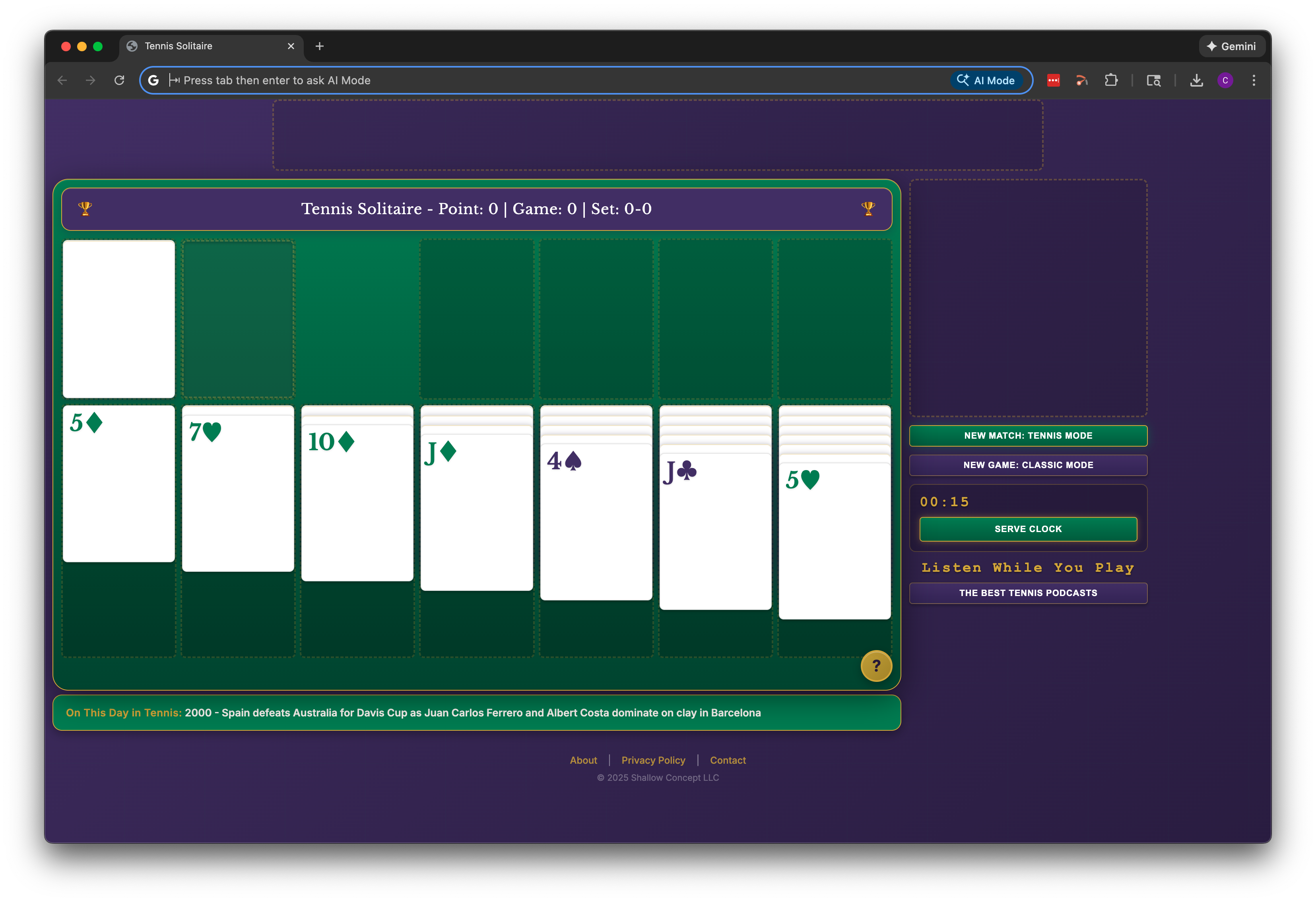
In the version below, tennis mode was set as the default rather than classic mode. Ideally this would be A/B tested, and maybe someday it will be. For now, there's no data for decision-making. The serve clock was also added around this time, giving players 15 seconds to make a move. The overall look and feel was decent now, but I started to consider what other content would be on the site and playing the game on mobile browsers. The current design was too fixed in the main gameplay area, and I thought that better use could be made of the screen real estate. The result of the redesign is below. Instead of just iterating through this in VS Code, I paused and created a revised layout in Canva to work off of. Ad placeholders moved, and all the buttons moved to the right sidebar on desktop.
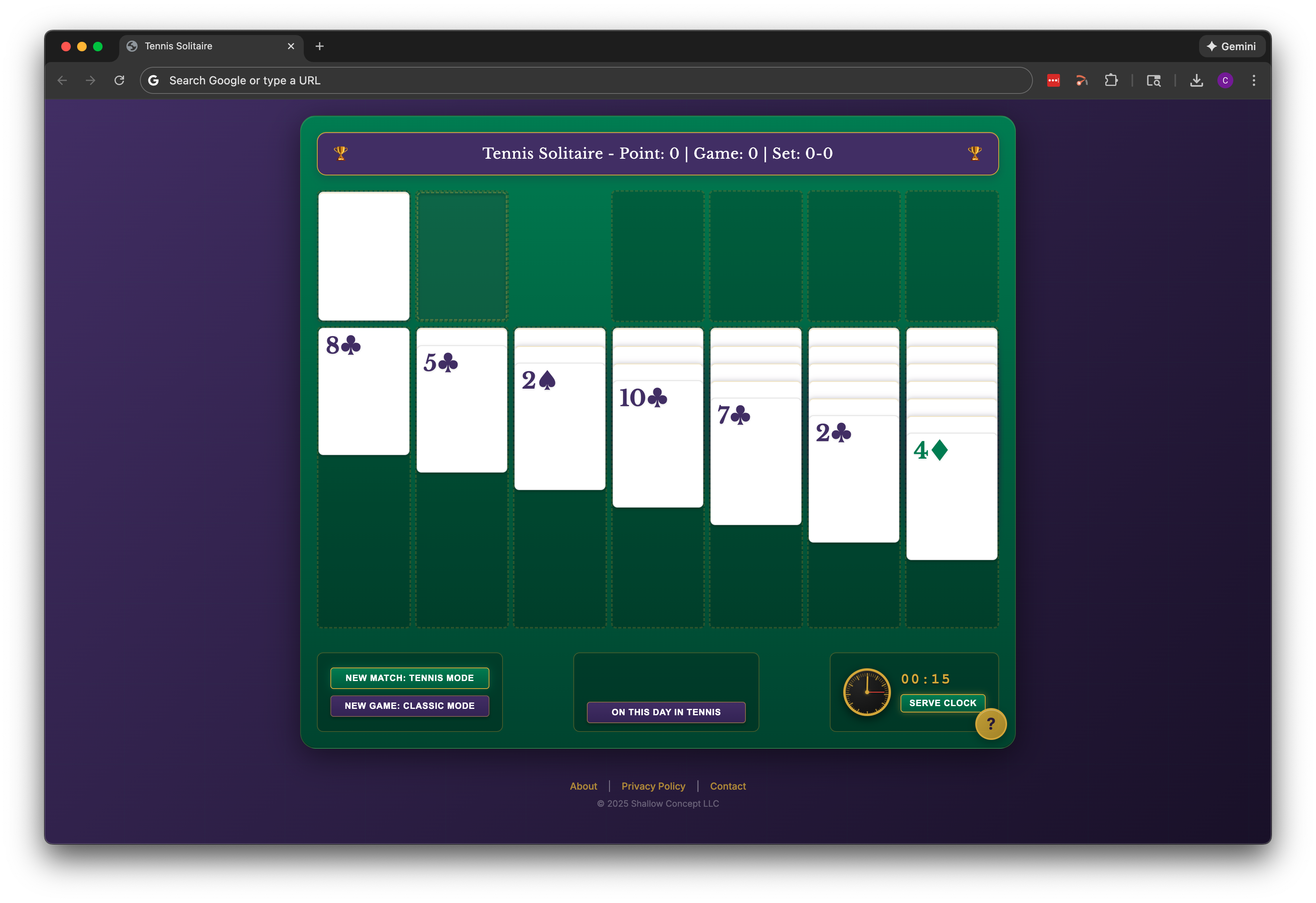
On This Day in Tennis became a fixed UI element rather than a button with an external API call. Even with the help of LLMs, sourcing the right mix of date-specific tennis facts was more of an effort than expected.
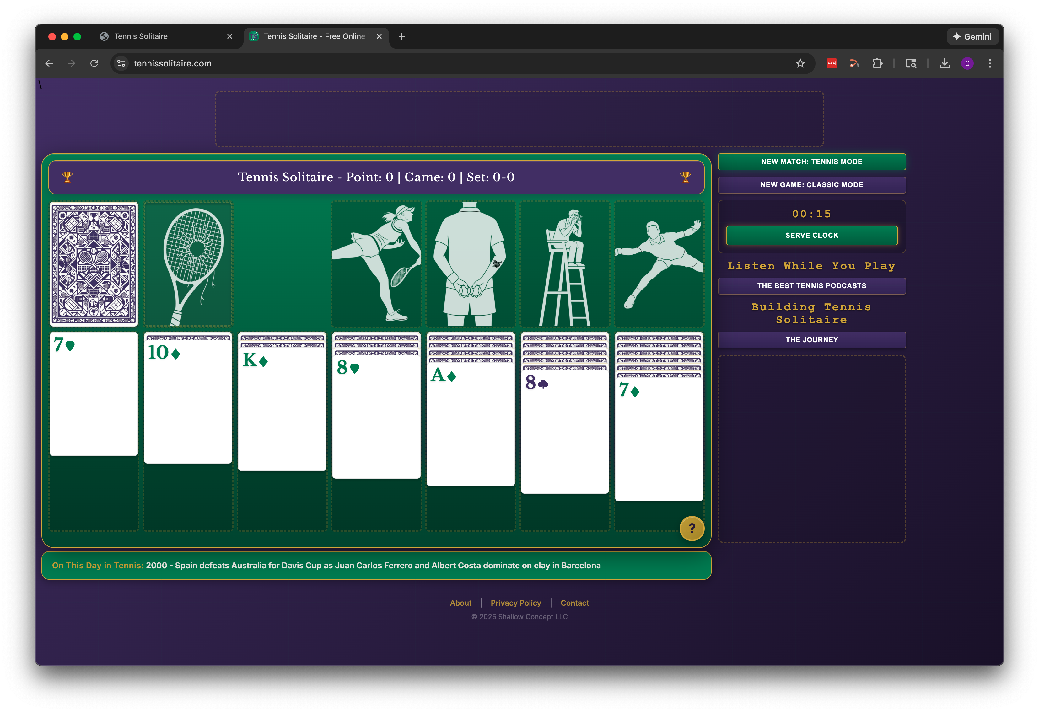
Below is the current desktop version of the web game. This version includes all the graphics because it's a screenshot of the actual live deployment. Right-side buttons were moved up above the ad placeholder. There is also a lot of refinement that isn't obvious (and for sure could still be improved upon). The UI was initially optimized for a 13-inch laptop screen. But experimenting with larger displays and unusually browser window configurations exposed some design flaws. This took a lot of trial and error to improve. And in the process of the above-mentioned trial and error, a bunch of new issues were created with the mobile breakpoints.
Buttons that were nicely aligned before I started tinkering were now overlapping or presenting differently depending on device and screen orientation.
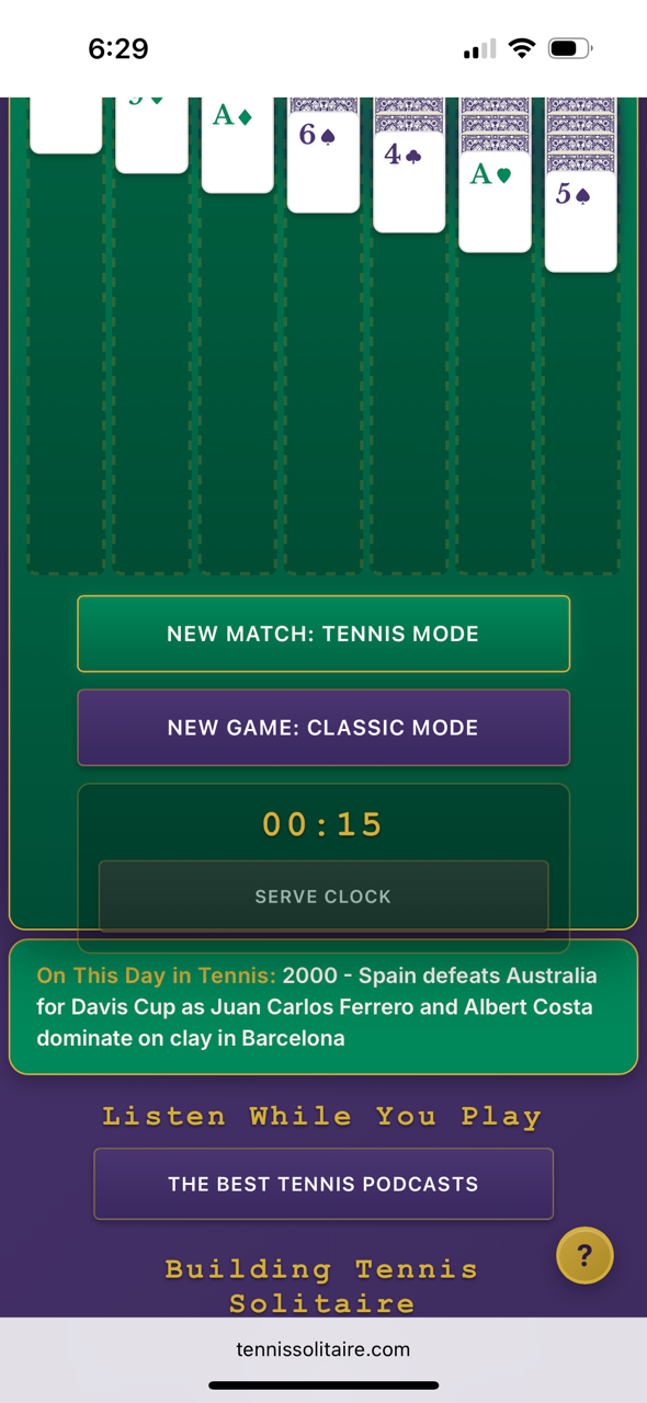
UI implementation presented all kinds of unexpected challenges and setbacks. For instance, for the longest time the card suit symbols would only appear in black or red on mobile, rather than the green and purple as intended. This consumed a full evening of troubleshooting to figure out that these symbols are unicode, and had to be replaced with an actual graphic to display properly. That's just one example. The plan now is to temporarily pause on UI refinements to work on some other priorities, including revising/improving some of the tutorial content (among other things).